My Portfolio
These are the moments that remind us what it feels like to be alive — fleeting, honest, and beautifully real.




Videography
Branding + Lifestyle Edit
*Not affiliated with or sponsored by Topgolf
Engagement Teaser
The Parthenon / Nashville, TN
Wedding Highlight
Louisville, KY
design & branding
Connecting products & services to people
Cinnabell
Bakery brand identity

Role: Brand Designer & Illustrator
Overview
Cinnabell is a cozy, artisan bakery dedicated to the art of the perfect cinnamon roll. The goal was to create a brand identity that feels both nostalgic and modern—warm, inviting, and irresistibly sweet.
The Solution
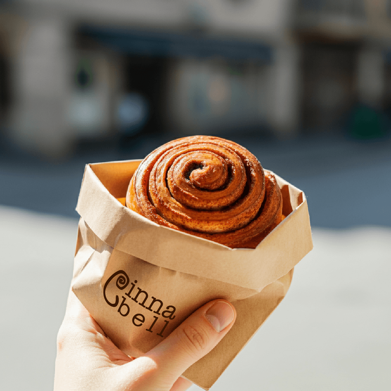
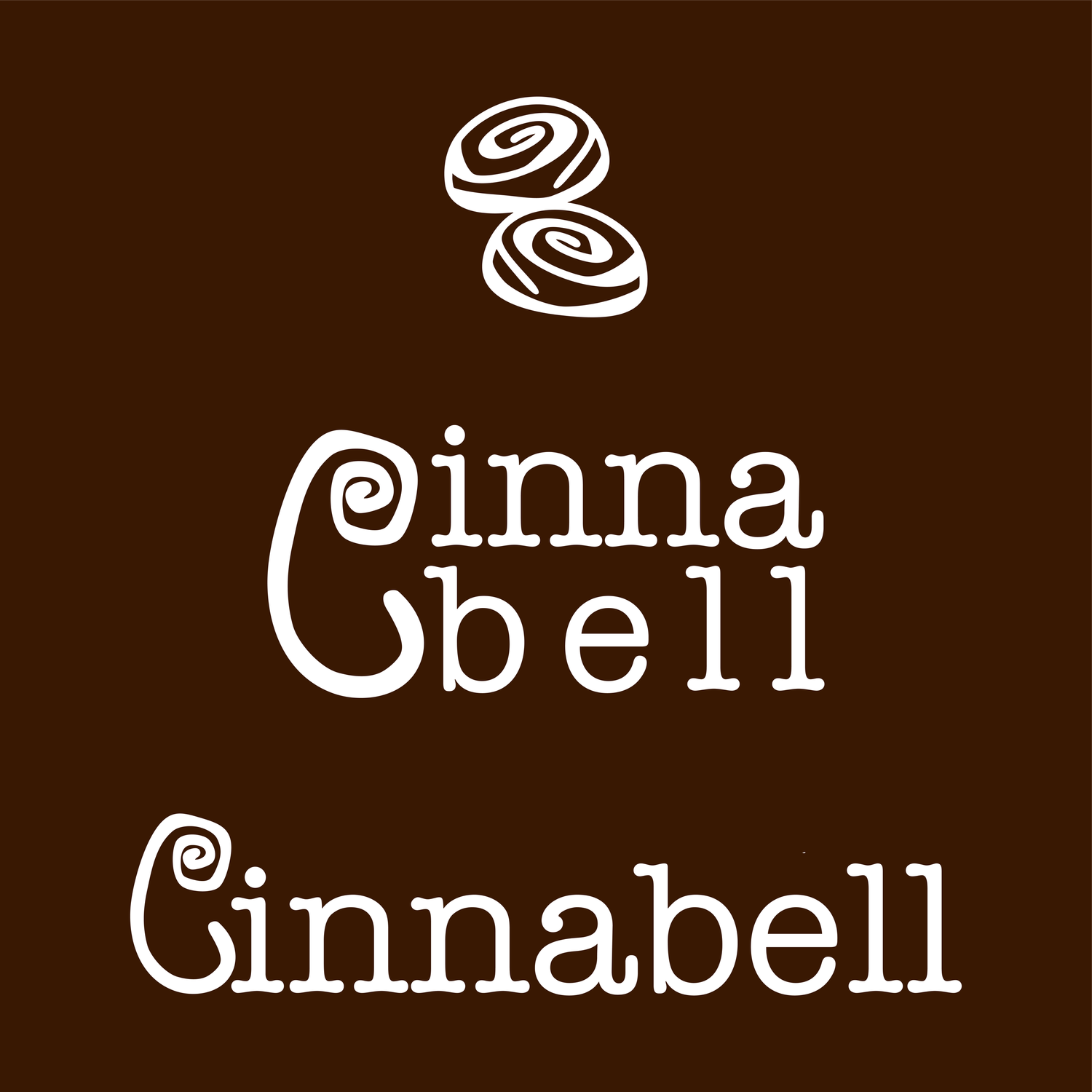
I designed a complete logo suite featuring a stylized, swirling "C" that mimics the spiral of a cinnamon roll, paired with a warm, sugary color palette of cinnamon brown, cream, and soft caramel.
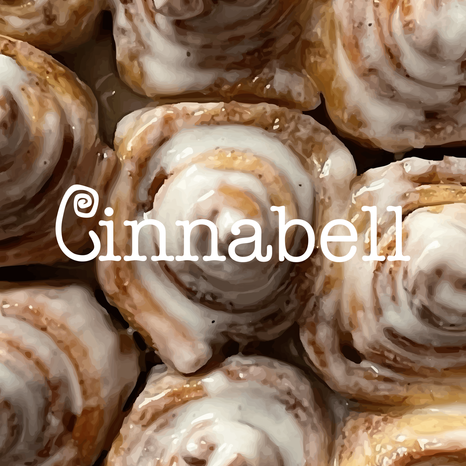
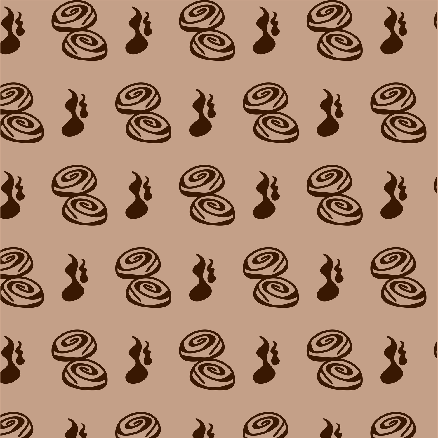
To enhance the brand experience, I developed a custom, repeating brand pattern—a playful hand-drawn illustration of cinnamon roll swirls and aromatic tendrils. This pattern was applied to paper carry-out bags, creating a memorable, "Instagrammable" unboxing experience. The final deliverables included the main logo, secondary marks, the custom pattern, and packaging mockups.
Key Deliverables:
Full Logo Suite (Primary, Secondary, Icon)
Custom Illustrated Pattern
Bag Packaging Design
saint
jewelry brand identity
Role: Brand Designer & Copywriter
Overview
Saint is a high-end jewelry brand that merges artisanal craftsmanship with a bold, contemporary edge. Moving away from traditional "quiet" luxury, Saint aims for a more commanding, high-fashion presence. The goal was to create a visual identity that feels both sacred and modern—jewelry as an icon of personal power.
The Solution
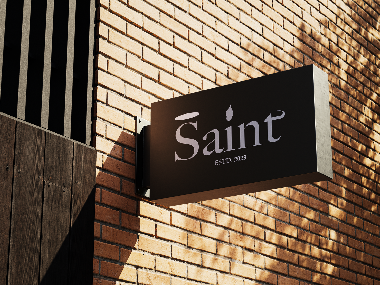
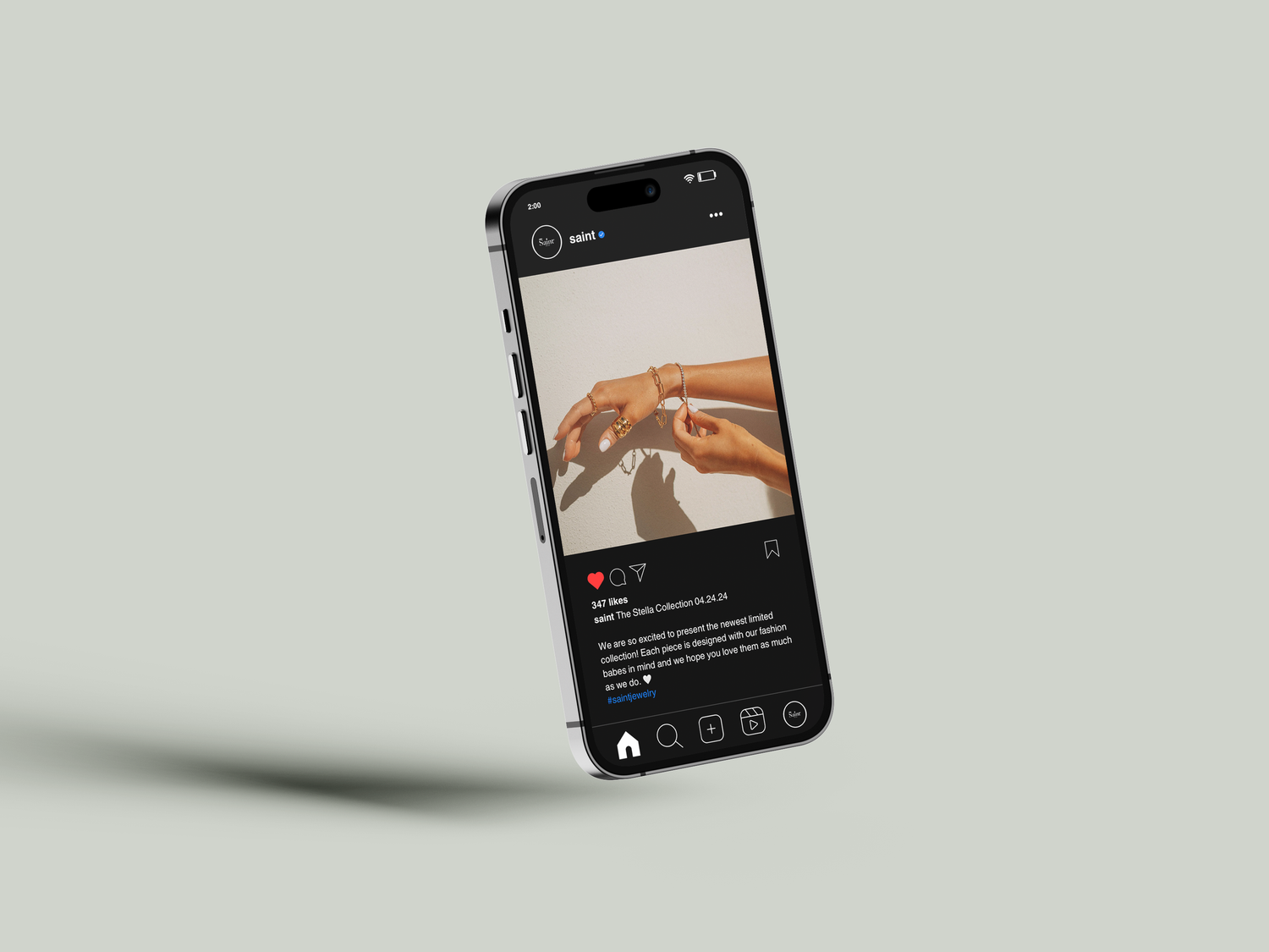
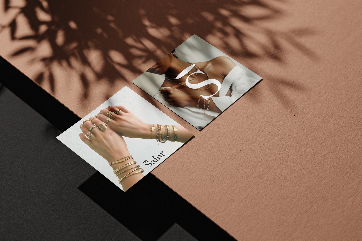
I developed a brand identity centered around a custom serif word-mark that features symbolic, illustrative accents—including a halo-inspired line over the "S" and a flame-like detail on the "i." By pairing this intricate typography with a stark, high-contrast palette of charcoal and bone, the brand commands immediate attention. This "modern gothic" luxury aesthetic was carried through into physical signage and editorial social content, ensuring Saint stands out as a definitive statement brand.
Key Deliverables:
Logo
Store Signage
Social Media Content
Brand Voice & Captions
nektar
honey brand identity
Role: Brand Designer & Illustrator
Overview
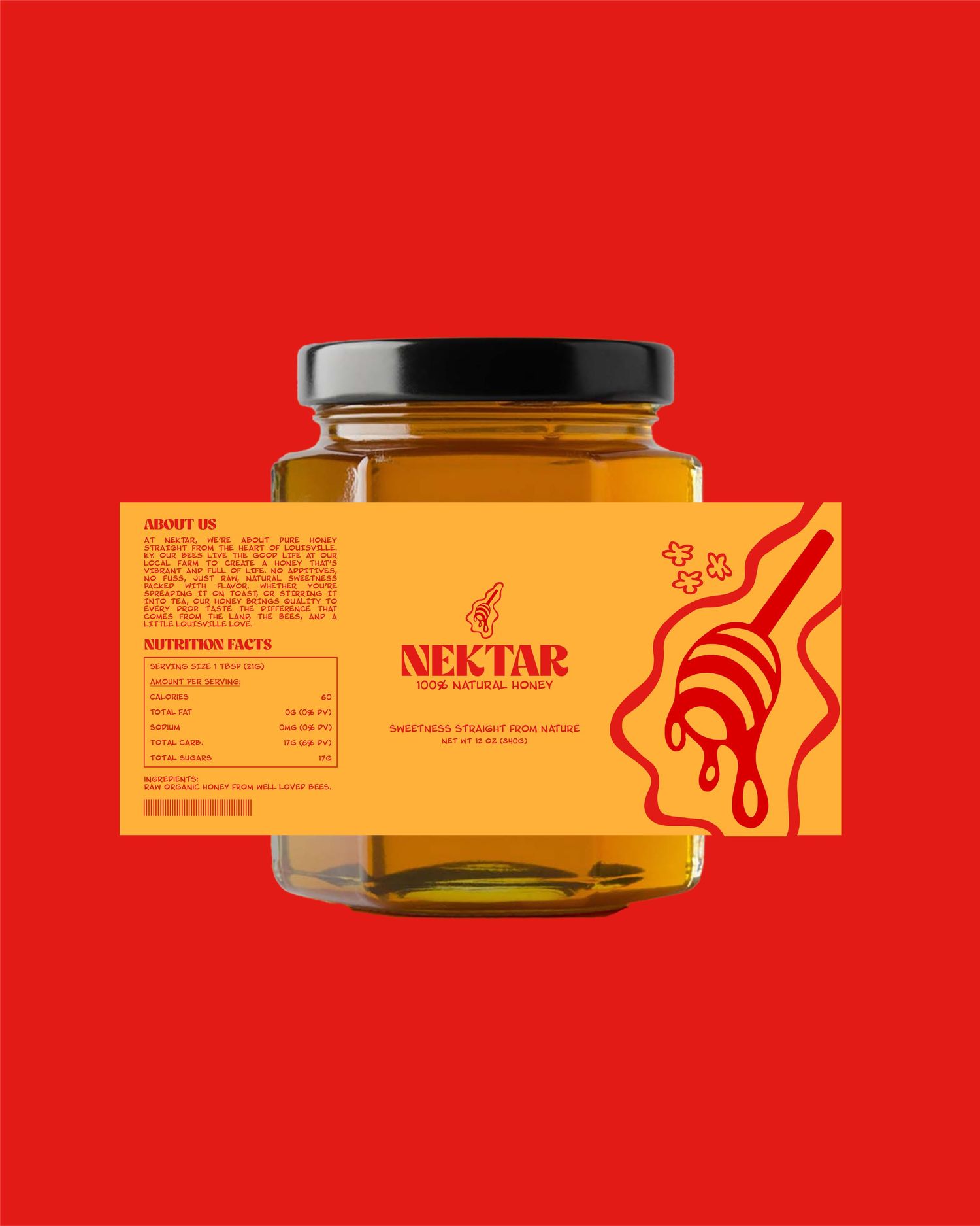
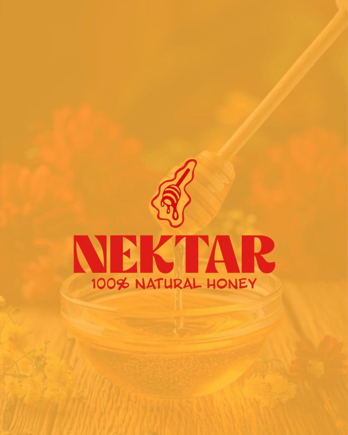
Nektar is a honey brand built on the philosophy of "sweetness straight from nature." The objective was to break away from the typical, muted "organic" aesthetic and create an identity that is high-impact and unmistakably bold. The brand is designed to feel energetic and modern, ensuring it commands attention on the shelf while maintaining a professional, high-quality finish.
The Solution
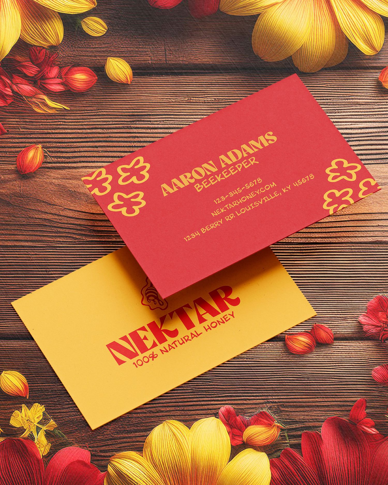
I developed a visual system centered on a high-contrast, saturated palette of poppy red and golden amber. The design utilizes a clean, architectural layout for the "Nutrition Facts" and "About Us" sections, creating a sharp contrast against the oversized, fluid hand-rendered illustration of the honey dipper. By pairing a thick, charismatic serif wordmark with minimalist floral icons, the brand achieves a vibrant, graphic look that is both premium and accessible.
Key Deliverables:
Logo Suite
Label Design
Business Cards
SCRUB
skincare brand identity
Role: Brand & Content Designer
Overview
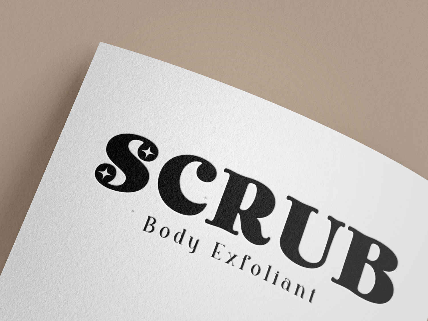
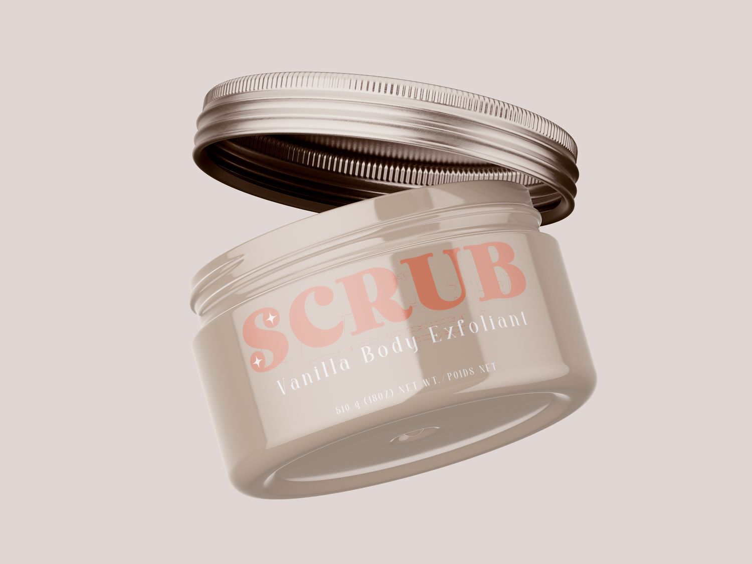
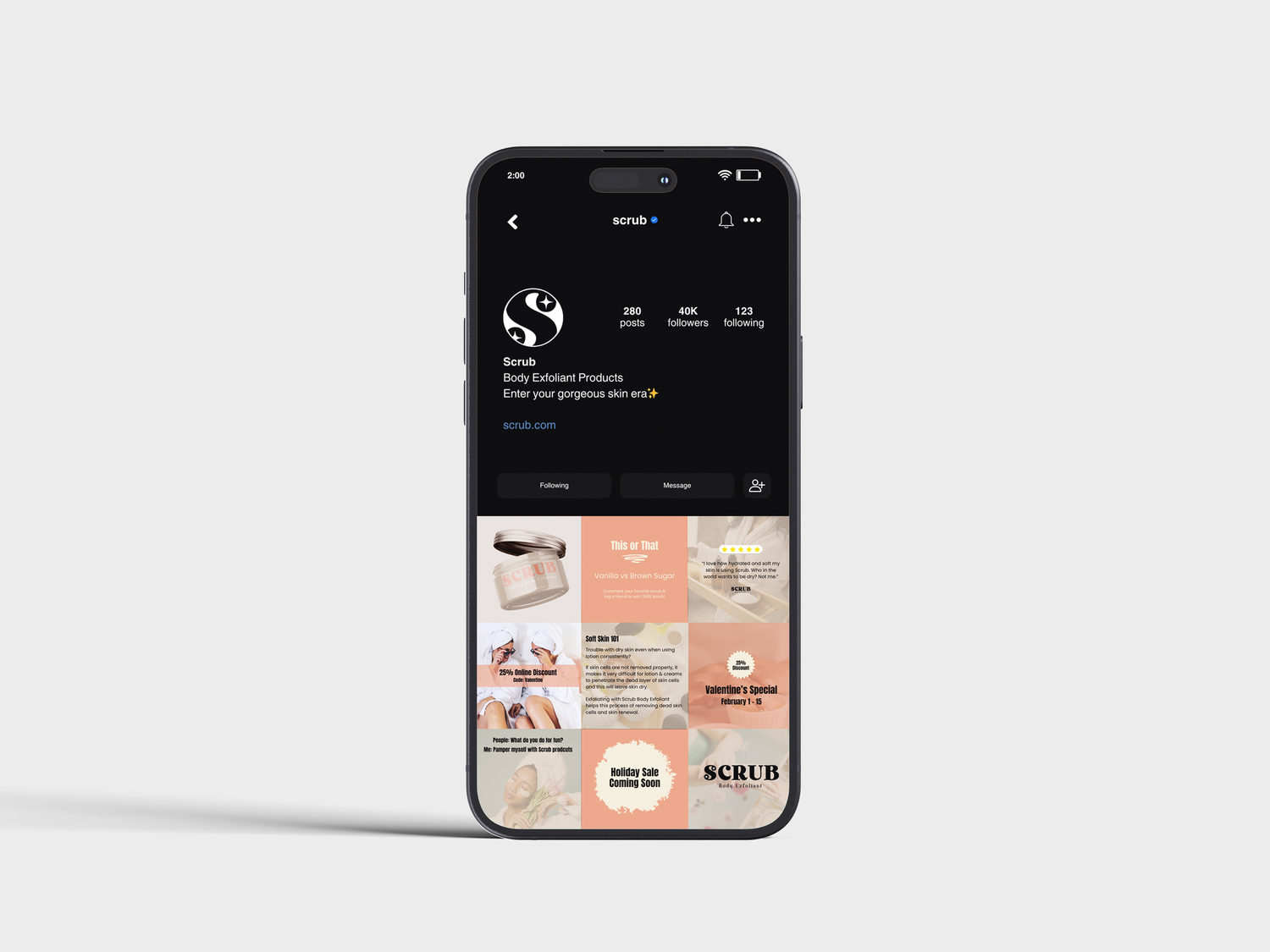
The skincare market is saturated with minimalist, "medical-grade" aesthetics that often feel cold and unapproachable. Scrub needed a brand identity that broke through this clinical noise by leaning into the sensory and indulgent nature of self-care. The goal was to create a visual language for a "Vanilla Body Exfoliant" that felt high-end enough for a vanity display, yet punchy and vibrant enough to capture immediate attention on a fast-moving social media feed.
The Solution
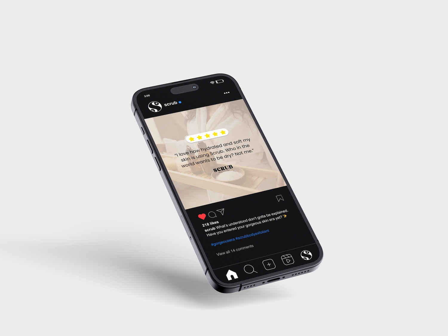
I developed a sensory-first visual identity centered on a bold, high-impact wordmark to ensure instant brand recognition. By pairing a sophisticated palette of warm taupes and soft corals, I positioned Scrub as an indulgent, daily self-care essential. The design strategy balances a heavy, modern serif with delicate, clean secondary typography to create a look that is both refined and visually inviting to the modern consumer.
Key Deliverables:
Logo Suite
Package Design Concept
Social Content Library
Pretz'd
food brand identity
Role: Brand & Content Designer
Overview
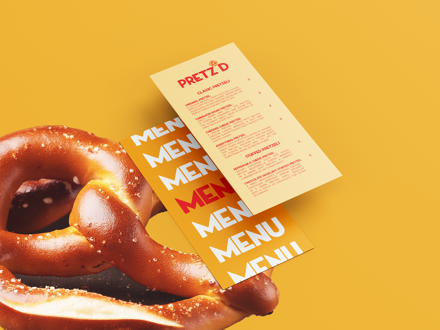
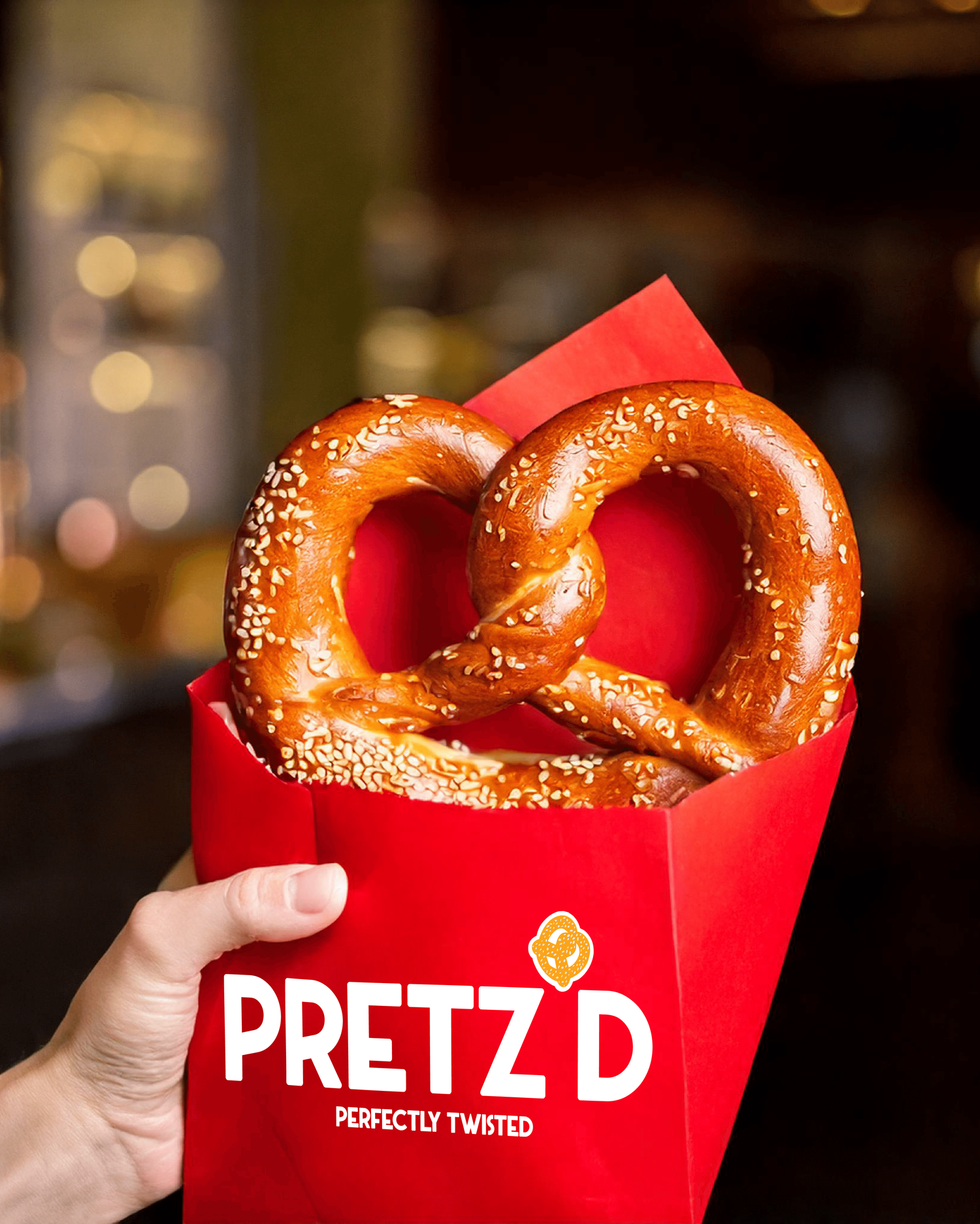
Traditional pretzel branding often feels quiet and rustic. Pretz’d needed a bold, high-energy identity to disrupt the category and capture immediate attention in a fast-paced urban environment. The goal was to build a brand that felt modern, playful, and—most importantly—instantly crave-able for a "grab-and-go" audience.
The Solution
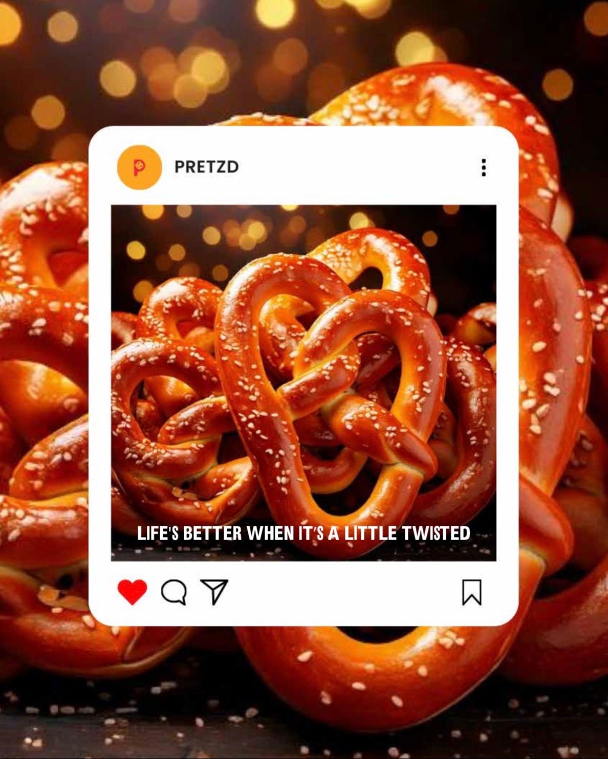
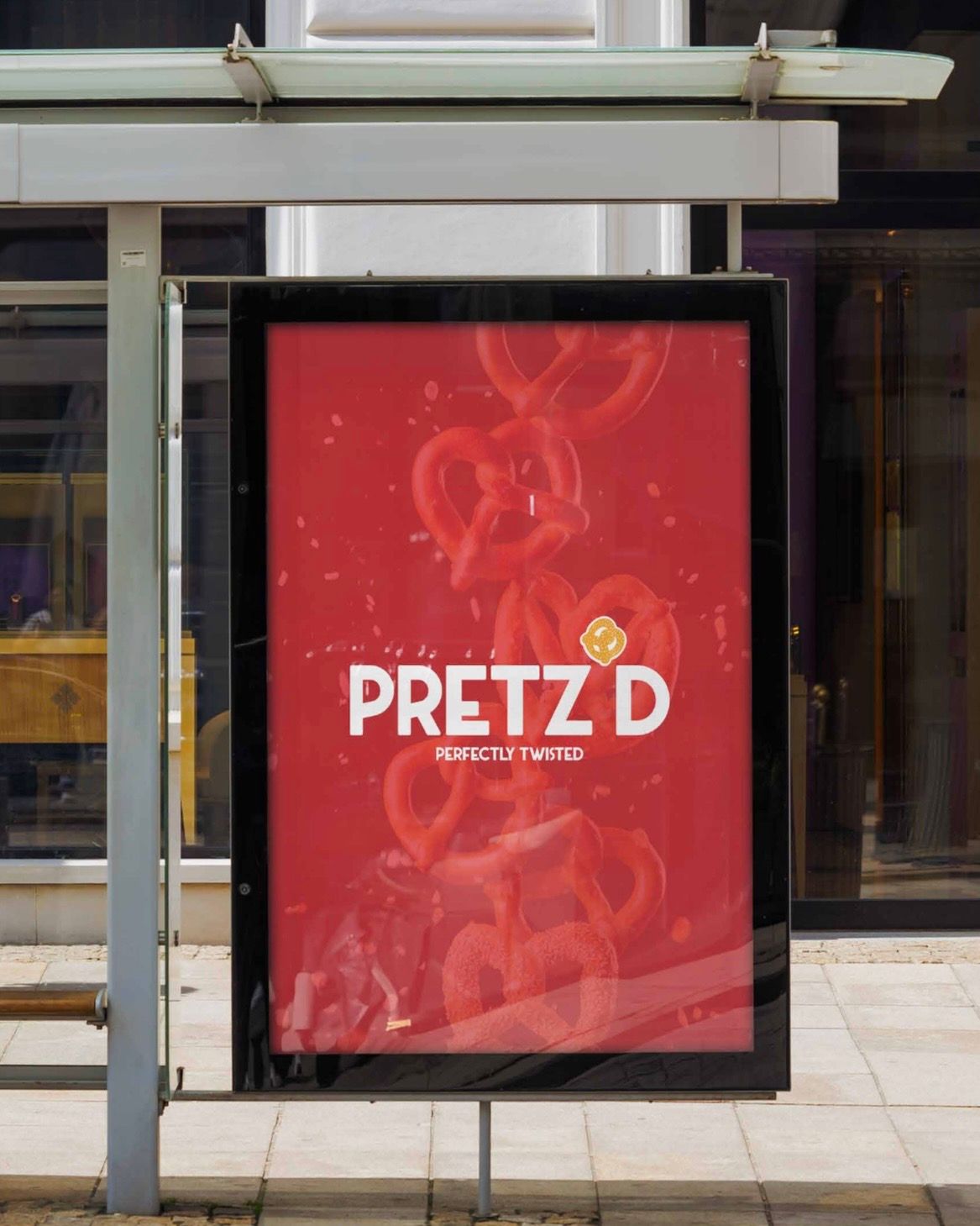
I leveraged color psychology as a primary driver, selecting a vibrant "High-Impact Red" specifically to stimulate appetite and command visual attention from a distance. To balance this intensity with a sense of craft, I developed original iconography from initial sketches, seamlessly integrating a playful pretzel motif into a bold, modern typeface. This bespoke approach ensures the identity feels "perfectly twisted" and entirely unique, while the minimalist, high-contrast packaging turns every customer into a walking billboard.
Key Deliverables:
Logo Suite
Tagline Development
Package Design Concept
Social Content Graphics
Menu Design
Poster Design
Environmental Mockups

You may be interested